Presentation Design Basics: A Guide for Salesforce Administrators :
by:
blow post content copied from Salesforce Admins
click here to view original post
Here’s a situation we can all recall: You have to give a presentation, and it’s time to start creating the slide deck. You begin by opening PowerPoint, making a title slide, putting some bullet points on the intro slide, and inserting a cute picture — and then you hit a wall. You give yourself kudos for getting this far and go get some coffee. You may think to yourself, “I’m not the best at using PowerPoint — there’s got to be a better way!”
It’s not about how pretty your slides are (well, it is, but that comes later). The basis of designing and delivering an awesome presentation is to craft a story and use visuals to support and strengthen that story.
This is especially key for the data-heavy presentations you create. Salesforce Admins and power users are in a unique position to help leadership understand business success metrics from reports and dashboards. But if you show slide after slides of charts and numbers, your audience won’t hear the story you’re telling.
In this post, you’ll learn how three Salesforce experts craft effective, impactful, and beautiful presentations. Sara Cattanach crafts messaging and content for the keynote presentations at Salesforce World Tour experiences, and coaches speakers to deliver great presentations. Aaron Rabideau and Gabrielle Tabios are the masterminds behind the presentation visuals at Salesforce’s largest events, including the Dreamforce keynote. Over and over again, they make it clear that slide design exists to support the presentation narrative.
Start with the narrative
Some of the best presentations have little or no visual elements. A slide deck is there to back you up, not to be the central focus. You want your audience members to leave saying, “What a great presentation!” not “What a great deck.” Your spoken delivery of the presentation is what will convince, inspire, or educate your audience.
Secret #1: Get the narrative, and titles, down completely before you start on the visuals. Otherwise, you’ll be rearranging slides and editing content when you change your story — you’ll end up doing twice the work on the presentation design elements.
When Sara is at square one starting a new presentation, she begins in a spreadsheet by writing out the narrative, with each slide title in its own row. When she has the story down, she goes to the speaker for the first round of feedback — before making a single slide.
Secret #2: Write the story of your presentation the way you write an essay. There should be a beginning, middle, and end. Different industries will have different ways of crafting stories, and knowing your audience is essential. Here are a few common structures:
- Thesis, supporting points, conclusion
- Summary, question posed, hypothesis, exploration, conclusion
- Problem, solution (it’s your company), how your offerings work, call to action (for example: “Learn more here,” or “Go deeper with small-group event sessions”)
- For a key or novel idea: what exists now, compare and contrast feature by feature
Every presentation should be tailored to your audience with a clear goal in mind. Is the point to convince investors to back your product? That’s a very different presentation than the first call deck your sales team will use about that same product. A presentation to your peers about research findings may rely much more on text and supporting stats than the same content delivered to an audience that is not as immersed in the field. Below are a few great examples of clear titles and narratives:
Why visuals matter
Aaron breaks down slide design into three basic tenets:
1. Hierarchy: Is it clear what the primary and secondary messages are? Are messages on the slide competing? Is the title actively working to reinforce your visuals?
2. Balance: Are you using the entire workspace? Is one thing too big compared to another?
3. Alignment: Do titles shift or fonts change size from slide to slide? Do you have clear margins across the entire deck?
The first step he takes when sitting down with a speaker is to say, “Tell me what it is you want me to know.” Aaron’s tips center around two basic goals for visuals: Have each slide reinforce (not distract from) the points in the narrative, and have the visuals be so organized that the audience experience is seamless. In short, you want the presenter to look good.
People are inherent problem solvers. If they see something wrong on a slide, they may not have the design eye to pick out exactly what’s wrong, but their attention will be taken away from what you are saying as they subconsciously work to figure out what’s off.
For example, putting up an even slightly blurry image will divert from what’s being said. Visuals are there to support the speaker and should never detract from the spoken presentation (read: no slides full of long bullet points or low-quality Google-sourced images!).
Taking the extra time upfront to clean up your slides reinforces that you take your presentation, audience, and message seriously. It’s why companies will spend big money on creative agencies that obsess over the details of an ad — if something is sloppy, it reflects poorly on the company. Set yourself up for success by creating consistency and a high standard for quality across your entire deck.
The basics of presentation design
By now, you should be convinced that PowerPoint is not your starting point. After you’ve nailed down your story, and the titles of each of your slides, you can finally get to what you came to this article for: creating impactful slides. The minute details and wizardry of slide creation are best left to training courses, but there are some important points to take home.
1. Each slide should convey one idea. If there are two ideas, break it into two slides. Gabrielle lays out a basic slide breakdown: The top-level thing is what you want the audience to grab right away (a callout, a key visual, or the title). The secondary element supports that first thing, and smaller elements can also be inserted if they don’t overwhelm the slide.
2. Consistency is key. Slide elements should be aligned: Things sit in the same place, are the same color, are the same size, and have the same amount of space between them. Use bold text minimally and a maximum of one highlight color.
3. Text should be minimized. The details of a slide — a picture, callout stat, quote, or subtitle — can support what you’re saying, but the slide shouldn’t speak for you. Newer speakers may need longer titles to help them remember the narrative while presenting. The better you get at storytelling, the less you will need those cues, and the more you can pare down the text on your slides to put your audience’s focus on your words.
4. Recurring images help enhance the narrative. Put a lot of thought into how your images support a slide’s key idea, make sure you use high-quality images, and consider using recurring images. Salesforce uses customer heroes that are tailored to our audience — customers who champion a specific product or are from the segment or industry that best matches who’s in the room. We often introduce this hero at the beginning with a theme — like “customer success” — and then bring them back in at later points to remind the audience of that theme. Even if they don’t consciously pick up on the reminder, using a recurring high-impact image will help shape your story arc and give consistency to your message.

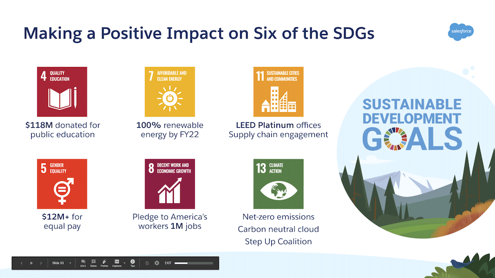
This slide draws the eye to the three main ideas and has supporting design elements containing characters to add in the fun and unify the theme.
Aaron gave one final piece of advice for designing slides, a pithy manifesto: “If you can’t afford to be minimalist, be clear.”
Learn more with these Trailhead modules:
- Storytelling and Communication
- Create Rad Content
- Use Storytelling in Presentations
- Virtual Presentations
The post Presentation Design Basics: A Guide for Salesforce Administrators appeared first on Salesforce Admins.
May 05, 2021 at 09:30PM
Click here for more details...
=============================
The original post is available in Salesforce Admins by
this post has been published as it is through automation. Automation script brings all the top bloggers post under a single umbrella.
The purpose of this blog, Follow the top Salesforce bloggers and collect all blogs in a single place through automation.
============================


Post a Comment